 Paint Color Lab
Creamy vs Alabaster
Creamy (LRV 81) and Alabaster (LRV 82) differ by 1 LRV point; their ΔE of 2.0 indicates very close colors.
Side by side
| Creamy | Alabaster | |
|---|---|---|
| LRV | 81 | 82 |
| Undertone | Warm (yellow) | Warm (yellow) |
| Hex | #EFE8DB | #EDEAE0 |
| Depth | Light | Light |
Color difference between them: ΔE 2000 = 2.0 (close, visible side by side).
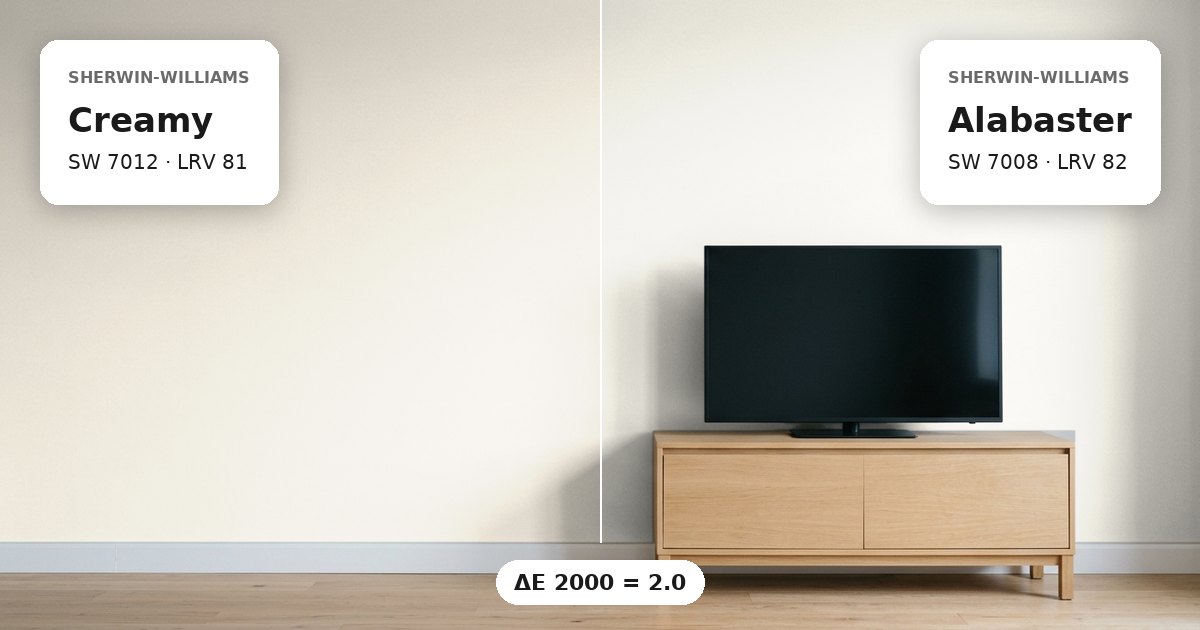
Creamy vs Alabaster: the measured difference
Sherwin-Williams Creamy (SW 7012) vs Alabaster refers to two warm white paints with a ΔE 2000 of 2.0. This places them in the close but visible side by side category. Both have yellow undertones, so their overall color direction is similar. However, their measured difference can become noticeable when the colors meet on adjoining walls, around corners, or across connected spaces. Creamy has the hex value #EFE8DB, while Alabaster is #EDEAE0. These values show subtle differences in their color composition. The distinction is not simply between a warm white and a cool white; both belong to the same broad color family. Their nearest other-brand matches also differ: Cozy White has a ΔE of 0.6 from Creamy, while Swiss Coffee has a ΔE of 0.8 from Alabaster.
Lightness and depth
Creamy has an LRV of 81, compared with 82 for Alabaster. The one-point gap is small, meaning both colors have very similar light-reflecting potential. Alabaster has the slightly higher LRV, so it may reflect marginally more light under comparable conditions. Neither value suggests a substantial brightness difference on its own. Room size, window placement, surrounding surfaces, and artificial lighting can all affect the appearance of white paint. Therefore, choosing between these colors should involve more than comparing their LRVs. Their subtle differences in color composition may matter as much as their nearly identical lightness, particularly where both finishes appear together.
Undertones and where each works
Both paints have warm yellow undertones. This shared characteristic can help maintain a consistent color direction across adjoining rooms, although the visible difference remains relevant. Creamy may suit a wall scheme where its specific off-white appearance works with the surrounding finishes, while Alabaster offers a similarly light alternative with a slightly higher LRV. In north-facing rooms, cooler daylight can make warm undertones more noticeable by comparison. South-facing rooms often receive warmer daylight, which can change how both whites appear throughout the day. For trim, compare each wall color against the actual trim paint rather than assuming either white will match automatically. If using both colors in connected spaces, test them on separate sample boards and view them together from the doorway. Keep the lighting and sheen consistent during comparison, because gloss level and reflections can influence perceived color. Evaluate the samples in morning, afternoon, and evening light before making a final selection.
Before you buy, compare a physical sample with the swatch on Sherwin-Williams’s page for Creamy and Sherwin-Williams’s page for Alabaster.
Values from each brand's own color page; ΔE and undertone are our calculations. See methodology. Not affiliated with any paint brand.