 Paint Color Lab
Accessible Beige vs Balanced Beige
Accessible Beige has an LRV of 58 and Balanced Beige 46, a 12-point difference; ΔE 5.6 means only similar colors.
Side by side
| Accessible Beige | Balanced Beige | |
|---|---|---|
| LRV | 58 | 46 |
| Undertone | Warm (yellow) | Warm (yellow) |
| Hex | #D1C7B8 | #C0B2A2 |
| Depth | Mid-tone | Mid-tone |
Color difference between them: ΔE 2000 = 5.6 (similar, clearly different).
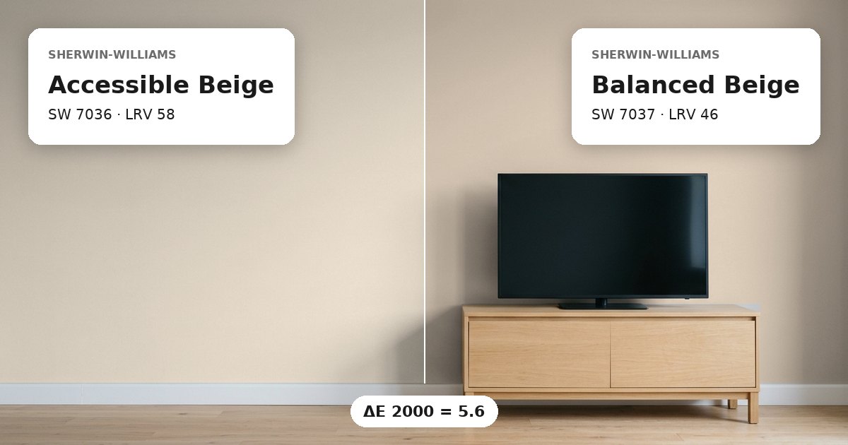
Accessible Beige vs Balanced Beige: the measured difference
Accessible Beige vs Balanced Beige have a ΔE 2000 of 5.6, meaning they are only similar rather than closely matched. Both colors fall within the beige and greige range, and both have warm yellow undertones. However, their measured difference is large enough to matter when they appear side by side. On adjoining walls, Accessible Beige should read lighter, while Balanced Beige should appear deeper. The contrast comes from both their lightness values and their differing hex values. Therefore, do not assume that their shared warmth will make them blend into one continuous color.
For a room that uses both shades, consider their placement before painting. Accessible Beige can cover the brighter or more open wall, while Balanced Beige can distinguish a neighboring area. However, the actual contrast will depend on the room’s lighting and the surfaces around each color. Test both samples together on adjacent sections of the wall to judge their relationship under the same conditions.
Lightness and depth
Accessible Beige has an LRV of 58, compared with 46 for Balanced Beige. The difference is 12 LRV points. Light reflectance value indicates how much visible light a paint color reflects, so the higher number generally corresponds to a brighter appearance. Accessible Beige is the lighter of these two mid-tone colors. Balanced Beige reflects less light and will generally look darker on the wall.
This difference can affect how continuous a room feels when the colors meet. Accessible Beige may appear more open in a well-lit area, while Balanced Beige can establish a more noticeable visual boundary. In a room with limited natural light, the lower-LRV color may appear especially deep. Compare samples during different parts of the day, because daylight and artificial lighting can change their apparent brightness.
Undertones and where each works
Both colors have warm yellow undertones, so their underlying warmth provides a shared element despite the visible difference. Accessible Beige is classified as greige, while Balanced Beige is classified as beige. Their hex values are #D1C7B8 and #C0B2A2, respectively. These measurements support a lighter appearance for Accessible Beige and a deeper one for Balanced Beige.
As general guidance, north-facing light often makes warm paint colors look less warm, while south-facing light can emphasize their warmth. Consider Accessible Beige where a lighter greige is needed and Balanced Beige where a deeper beige provides useful separation. White trim can create a clearer edge around either shade, depending on the trim’s own undertone. For adjoining rooms, repeat the samples near doorways and compare them in both spaces. Use the same lighting conditions and sample sheen where possible, since sheen can affect how a painted surface reflects light.
Before you buy, compare a physical sample with the swatch on Sherwin-Williams’s page for Accessible Beige and Sherwin-Williams’s page for Balanced Beige.
Values from each brand's own color page; ΔE and undertone are our calculations. See methodology. Not affiliated with any paint brand.