 Paint Color Lab
Sea Salt vs Rainwashed
Sea Salt has an LRV of 63 versus 59 for Rainwashed, a 4-point difference; ΔE is 3.0.
Side by side
| Sea Salt | Rainwashed | |
|---|---|---|
| LRV | 63 | 59 |
| Undertone | Green | Green |
| Hex | #CDD2CA | #C2CDC5 |
| Depth | Light | Mid-tone |
Color difference between them: ΔE 2000 = 3.0 (close, visible side by side).
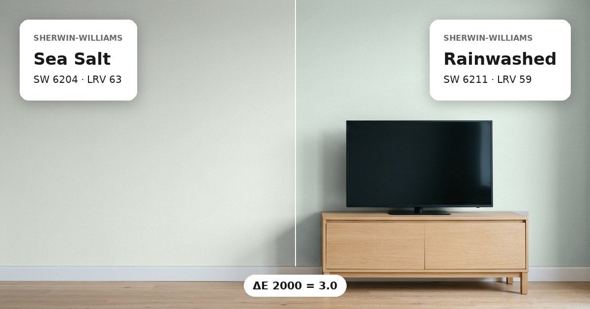
Sea Salt vs Rainwashed: the measured difference
Sea Salt vs Rainwashed have a ΔE 2000 of 3.0, meaning they are close colors with a visible difference when placed side by side. Both belong to the green color family and have green undertones. Their shared classification makes them related choices, but the measured difference means they should not be treated as interchangeable in every application. Sherwin-Williams Sea Salt has the higher light reflectance value, so it generally reflects more light than Rainwashed. This difference can become apparent where painted surfaces meet, particularly across adjoining walls receiving similar illumination. Their green undertones provide continuity, while their difference in depth helps distinguish the two finishes visually.
Lightness and depth
Sherwin-Williams Sea Salt (SW 6204) has an LRV of 63, compared with 59 for Sherwin-Williams Rainwashed (SW 6211). The gap is 4 LRV points. Light reflectance value indicates the proportion of visible light reflected by a surface, so a higher value generally corresponds to a brighter appearance under comparable conditions. Sea Salt should therefore read somewhat lighter than Rainwashed, although the difference is not an exact prediction of perceived brightness. Room orientation, bulb temperature, and nearby surfaces can change how much distinction you notice. Both values fall within a relatively light-to-midrange portion of the reflectance scale, so neither color has the low-reflectance profile associated with a particularly dark paint.
Undertones and where each works
Both colors have green undertones, making them a related option for spaces where a consistent green-based palette is important. Daylight direction can change their appearance. North-facing light is generally cooler, which may make green qualities appear more pronounced or muted depending on the surrounding colors. South-facing light is typically warmer and more direct, potentially shifting how the green undertones are perceived. These effects vary with the room and its finishes, so evaluate the colors in the intended space rather than relying on a color chip alone.
Sea Salt can be considered where a lighter wall color is desired, while Rainwashed offers a slightly lower-reflectance alternative. White trim can separate either shade from doors, windows, and baseboards; the strength of that contrast depends on the white’s undertones and brightness. In adjoining rooms, choose whether you want the transition to remain subtle or make the change in depth more apparent. Apply sample patches on different walls and inspect them in morning, afternoon, and artificial light before settling on a coordinated scheme.
Before you buy, compare a physical sample with the swatch on Sherwin-Williams’s page for Sea Salt and Sherwin-Williams’s page for Rainwashed.
Values from each brand's own color page; ΔE and undertone are our calculations. See methodology. Not affiliated with any paint brand.