 Paint Color Lab
Repose Gray vs Revere Pewter
Repose Gray has an LRV of 58 versus 55.05 for Revere Pewter, a 2.95-point difference; ΔE is 2.3.
Side by side
| Repose Gray | Revere Pewter | |
|---|---|---|
| LRV | 58 | 55.05 |
| Undertone | Warm (yellow) | Warm (yellow) |
| Hex | #CCC9C0 | #CBC6B8 |
| Depth | Mid-tone | Mid-tone |
Color difference between them: ΔE 2000 = 2.3 (close, visible side by side).
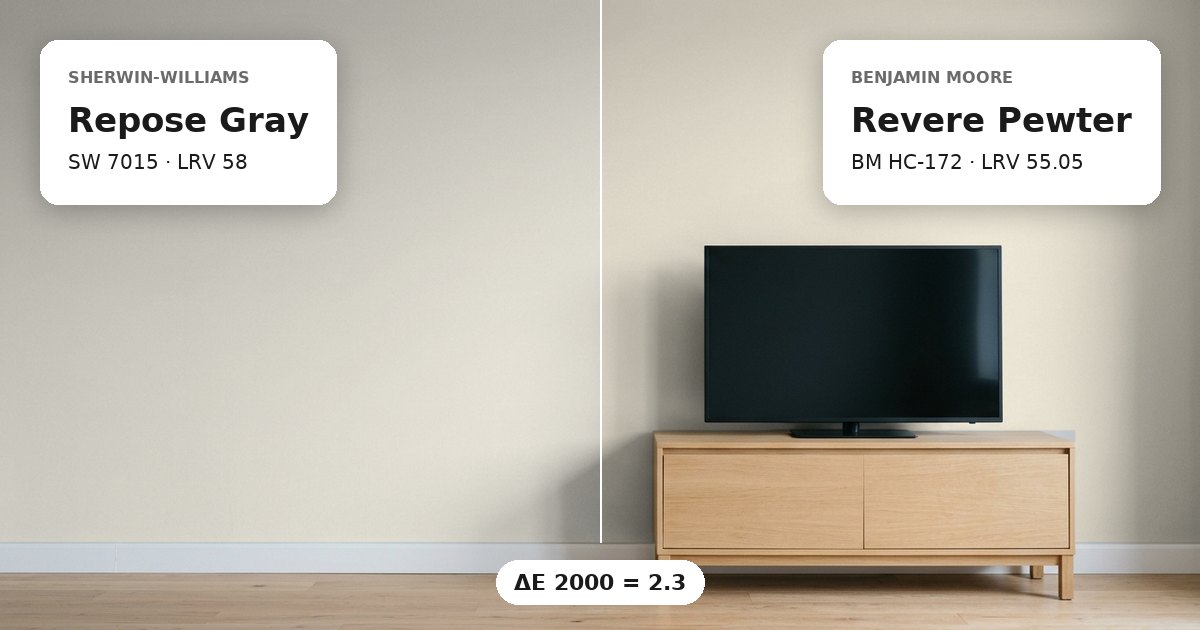
Repose Gray vs Revere Pewter: the measured difference
Repose Gray vs Revere Pewter have a measured color difference of ΔE 2.3, which places them in the close-but-visible category. Both are warm greiges with yellow undertones, so they share a similar underlying color direction. However, their hex values are not identical. Sherwin-Williams Repose Gray (SW 7015) is #CCC9C0, while Benjamin Moore Revere Pewter (HC-172) is #CBC6B8. These values suggest a small but discernible distinction, particularly when the paints meet on adjoining walls. The pair is more closely related than two colors from different undertone families, but their different lightness values can still help define separate spaces. Direct comparison in the intended room is more reliable than viewing either color alone.
Lightness and depth
Repose Gray has an LRV of 58, compared with 55.05 for Revere Pewter. The gap is 2.95 points, so Repose Gray reflects somewhat more light and may appear slightly brighter under comparable lighting. Both colors are classified as mid-tones in the supplied data. Therefore, the LRV difference is modest rather than a major shift from a light wall to a dark one. Repose Gray can be considered where a marginally lighter greige is wanted, while Revere Pewter offers a little more depth. Actual brightness also depends on window exposure, the amount of natural light, and the reflectance of surrounding finishes. In a room with limited daylight, both may appear deeper than they do in a bright room. Test them together to see whether their small difference is sufficient for the intended layout.
Undertones and where each works
Both colors have warm yellow undertones, making them plausible options for a coordinated palette across connected rooms. North-facing light often appears cooler, which can bring warmth into stronger contrast. South-facing light generally appears warmer and may emphasize the yellow component, although each room will respond differently. Repose Gray may suit a wall where slightly greater reflectance is useful, while Revere Pewter can introduce a subtle increase in depth in an adjoining space. White trim can frame both greiges, but compare its undertone against the yellow warmth rather than choosing a white in isolation. When the paints meet at a doorway, use sample boards on opposite sides of the opening. View them in morning and evening light, and check how they relate to flooring and other fixed finishes before selecting the final combination.
Before you buy, compare a physical sample with the swatch on Sherwin-Williams’s page for Repose Gray and Benjamin Moore’s page for Revere Pewter.
Values from each brand's own color page; ΔE and undertone are our calculations. See methodology. Not affiliated with any paint brand.