 Paint Color Lab
Repose Gray vs Agreeable Gray
Repose Gray has an LRV of 58 and Agreeable Gray 60, a 2-point difference; ΔE 1.6 means they are very close.
Side by side
| Repose Gray | Agreeable Gray | |
|---|---|---|
| LRV | 58 | 60 |
| Undertone | Warm (yellow) | Warm (yellow) |
| Hex | #CCC9C0 | #D1CBC1 |
| Depth | Mid-tone | Light |
Color difference between them: ΔE 2000 = 1.6 (very close).
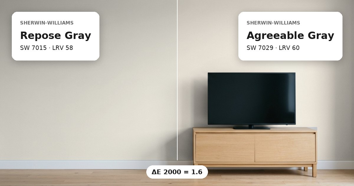
Repose Gray vs Agreeable Gray: the measured difference
Repose Gray vs Agreeable Gray have a ΔE 2000 of 1.6, meaning they are very close in measured color difference. Both are greige paints with warm yellow undertones, so they share the same broad color classification and undertone description. However, their hex values differ: Repose Gray is #CCC9C0, while Agreeable Gray is #D1CBC1. On adjoining walls, the two colors may look closely related, yet a slight distinction can remain visible at corners and doorways.
Their shared undertones can support continuity between connected spaces, particularly when the aim is to keep a similar greige appearance. Still, the measured difference should not be treated as a guarantee that the colors will look identical under all lighting conditions. Compare them directly on the same wall plane or on adjoining sample boards. This reveals whether the distinction suits the transition between the rooms.
Lightness and depth
Repose Gray has an LRV of 58, compared with 60 for Agreeable Gray. The gap is 2 LRV points. Because a higher light reflectance value generally means greater reflection of visible light, Agreeable Gray has the higher stated brightness value. Repose Gray’s lower number suggests a slightly deeper appearance. Both values fall within a similar range, which is consistent with their close measured color relationship.
In a connected layout, this small difference can offer a subtle shift without introducing a major change in lightness. Agreeable Gray may appear marginally brighter, while Repose Gray may read slightly deeper. Actual brightness will vary with window direction, room dimensions, and nearby finishes. If the walls receive different amounts of daylight, the same two paints may appear more distinct in one room than the other. Check the samples in each location before deciding how to distribute them.
Undertones and where each works
Both colors have warm yellow undertones and are categorized as greige. Their nearest other-brand matches are Dolphin Fin for Repose Gray, with a ΔE of 0.6, and Heritage Gray for Agreeable Gray, with a ΔE of 0.0. These figures describe each color’s stated nearest match, not the difference between Repose Gray and Agreeable Gray. The main comparison remains the ΔE of 1.6.
Consider Repose Gray for an area where a slightly deeper greige is useful and Agreeable Gray where a marginally higher LRV is preferred. In north-facing rooms, warm undertones can appear less pronounced; south-facing daylight can bring out more warmth. White trim can define the edges of either shade, but its own undertone affects the contrast. For adjoining rooms, compare both colors against the same trim and flooring samples. Keep sample finishes consistent during the initial comparison, then evaluate the intended sheen separately before painting the full surfaces.
Before you buy, compare a physical sample with the swatch on Sherwin-Williams’s page for Repose Gray and Sherwin-Williams’s page for Agreeable Gray.
Values from each brand's own color page; ΔE and undertone are our calculations. See methodology. Not affiliated with any paint brand.