 Paint Color Lab
Mindful Gray vs Repose Gray
Mindful Gray (LRV 48) is 10 points darker than Repose Gray (LRV 58); ΔE 4.7 means the colors are only similar.
Side by side
| Mindful Gray | Repose Gray | |
|---|---|---|
| LRV | 48 | 58 |
| Undertone | Warm (yellow) | Warm (yellow) |
| Hex | #BCB7AD | #CCC9C0 |
| Depth | Mid-tone | Mid-tone |
Color difference between them: ΔE 2000 = 4.7 (similar, clearly different).
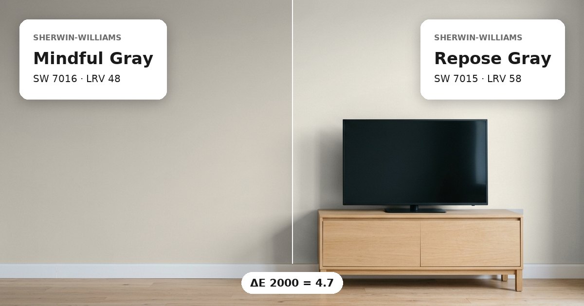
Mindful Gray vs Repose Gray: the measured difference
Mindful Gray vs Repose Gray have a measured color difference of ΔE 4.7, which places them in the category of colors that are only similar rather than nearly interchangeable. Both are warm greiges with yellow undertones, but their difference can become apparent when the two paints meet on adjoining walls. Mindful Gray has the darker, more muted-looking appearance suggested by its lower LRV, while Repose Gray reflects more light. Their hex values also show a distinction: Mindful Gray is #BCB7AD, compared with #CCC9C0 for Repose Gray. These differences make the pair worth comparing in the actual room before choosing one for connected spaces.
Lightness and depth
Mindful Gray has an LRV of 48, while Repose Gray has an LRV of 58. The 10-point gap means Repose Gray reflects more light and will generally appear brighter under comparable lighting conditions. Mindful Gray sits at the lower end of this pair’s mid-tone range, giving it greater visual depth. Repose Gray can help a room feel lighter without moving into a very pale color category. However, neither LRV determines the final appearance on its own. Window size, wall orientation, surrounding surfaces, and artificial lighting all affect how much brightness a painted wall seems to have. In a connected space, the lighter color may read more prominently where daylight is limited, while the darker option can establish a clearer visual distinction.
Undertones and where each works
Both colors have warm yellow undertones, so they share a similar underlying direction despite their visible difference. North-facing rooms often receive cooler daylight, which can make warm undertones more noticeable by comparison. South-facing rooms typically receive warmer, more direct daylight, which may change how the two greiges appear throughout the day. Mindful Gray can suit walls where a deeper mid-tone is needed, while Repose Gray offers a lighter alternative for adjacent rooms or larger wall areas. For trim, a clean white can provide contrast, but its own undertones should be checked against both greiges. When these colors meet at a doorway or on adjoining walls, sample them side by side under the room’s actual lighting. Compare them in the morning and evening before deciding whether their difference supports the intended transition.
Before you buy, compare a physical sample with the swatch on Sherwin-Williams’s page for Mindful Gray and Sherwin-Williams’s page for Repose Gray.
Values from each brand's own color page; ΔE and undertone are our calculations. See methodology. Not affiliated with any paint brand.